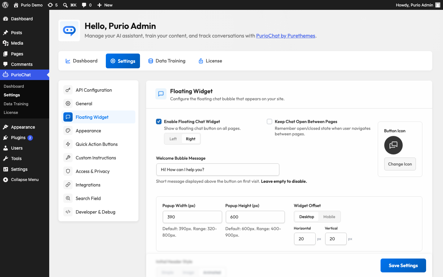
The floating chat widget is the chat bubble in the corner of your site that follows visitors from page to page. It’s enabled by default on new installs, so most sites have it running already. This article covers every control for positioning, sizing, and styling it.
You’ll find these settings under PurioChat → Settings → Floating Widget. They’re all in the free version of PurioChat.
Turning the widget on or off
The Enable Floating Chat Widget toggle controls whether the bubble appears at all. It’s on by default. Turn it off if you’d rather place the chat on specific pages with the [ai_chat] shortcode instead.
Next to the toggle, Widget Position sets whether the bubble sits in the bottom-Left or bottom-Right corner. The default is right, where visitors expect to find a chat button.
Keep Chat Open Between Pages remembers whether a visitor had the chat window open and restores that state as they browse. Handy for longer conversations, so the chat doesn’t snap shut every time someone clicks a link.
The welcome bubble
The Welcome Bubble Message is the small speech bubble that pops up above the button to invite people to chat. The default text is “Hi! How can I help you?”, and you can style it with simple HTML. It shows on a visitor’s first visit and disappears once they click it or open the chat, then stays hidden for that browser.
Custom button icon
By default the widget uses PurioChat’s built-in chat bubble icon. To use your own, upload an image under Button Icon. Once a custom icon is set, an Icon Size field appears to control how large it renders. The size is in pixels and defaults to 32, with a range of 8 to 100 pixels.
Sizing the chat window
Two settings control how big the chat popup is when a visitor opens it:
| Setting | Default | Range | What it controls |
|---|---|---|---|
| Popup Width | 390 px | 320–800 px | How wide the open chat window is. |
| Popup Height | 600 px | 400–900 px | How tall the open chat window is. |
The defaults work well for most layouts. Make the window bigger if your chatbot shows product or listing cards and you want more room for them.
Fine-tuning the position with offsets
The Widget Offset controls nudge the button away from the screen edges so it doesn’t collide with other elements like a cookie banner or back-to-top button. There are separate offsets for desktop and mobile, each with a horizontal and vertical value:
- Desktop Horizontal & Desktop Vertical — how far the button sits from the side and bottom edges on larger screens.
- Mobile Horizontal & Mobile Vertical — the same, applied on phones and small screens.
Each offset defaults to 20 pixels and can be set from 0 to 200. Separate values let you keep the button clear of your mobile navigation without affecting the desktop layout.
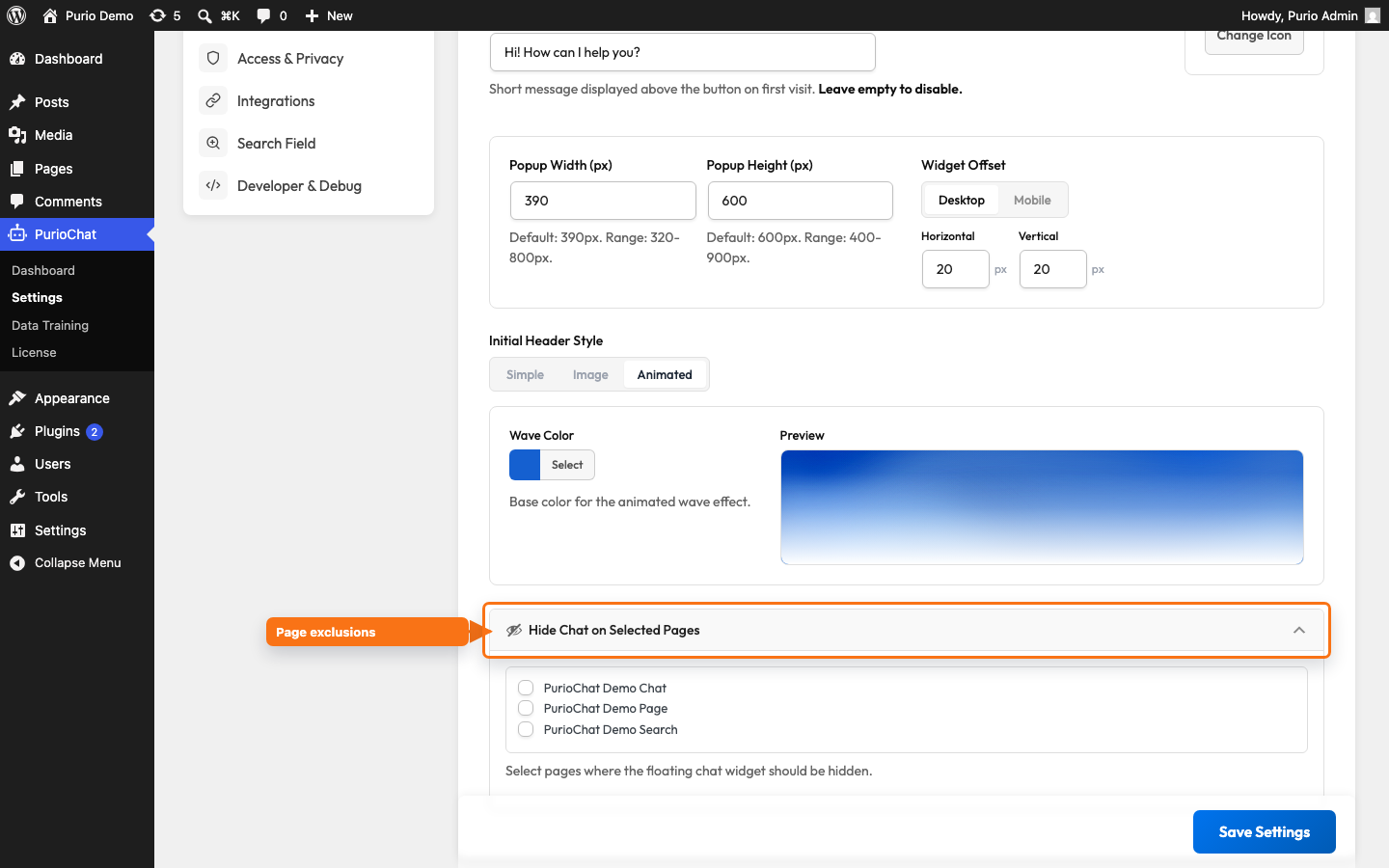
The initial header style
The header is the top section of the chat window. Initial Header Style controls its look before the first message, with three choices:
- Simple (the default) — a clean, plain header bar.
- Image — a custom background image fills the header. Upload one under Header Background Image (around 400×120px or larger works best; the image is cropped to fit). Turn on Enable overlay to blend the image with the chat background for better text contrast.
- Animated — an animated “silk wave” effect fills the header. Set its base color with the Wave Color picker, which defaults to
#1560d0.

Hiding the widget on specific pages
The Hide Chat on Selected Pages control lets you pick individual WordPress pages where the floating widget should never appear. Good for checkout, login, or other focused flows where a chat bubble would distract.
Expand the panel and tick the pages you want to exclude. The setting applies to singular pages only.
