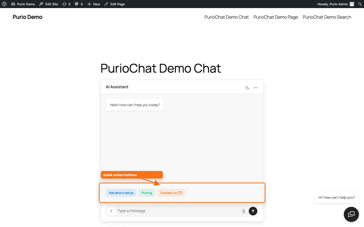
Quick Action Buttons are clickable suggestion buttons that sit above the chat input. They give first-time visitors an obvious next step instead of a blank box, pointing them toward your most common questions, an important page, or a way to get in touch.
Where to find it
Open PurioChat → Settings → Quick Action Buttons (the sub-section in the left sidebar of the Settings tab).
Turning buttons on or off (Free)
The master switch is Enable Quick Action Buttons. On a fresh install it’s enabled, so buttons show up automatically once you’ve defined at least one. Turn it off to give visitors a clean, empty input.
Adding buttons (Pro)
With Pro active, the section becomes a repeatable list. Click + Add Button to add as many as you like, then fill in each one. Buttons with empty text are skipped, so an unfinished row won’t break your chat.
Each button has the same fields:
- Button Text — the label visitors see (for example, “View pricing” or “Talk to us”).
- Type — what happens on click (see below).
- Value — the preset message to send, or the URL to open, depending on the type.
- Custom color — an optional color for that button.
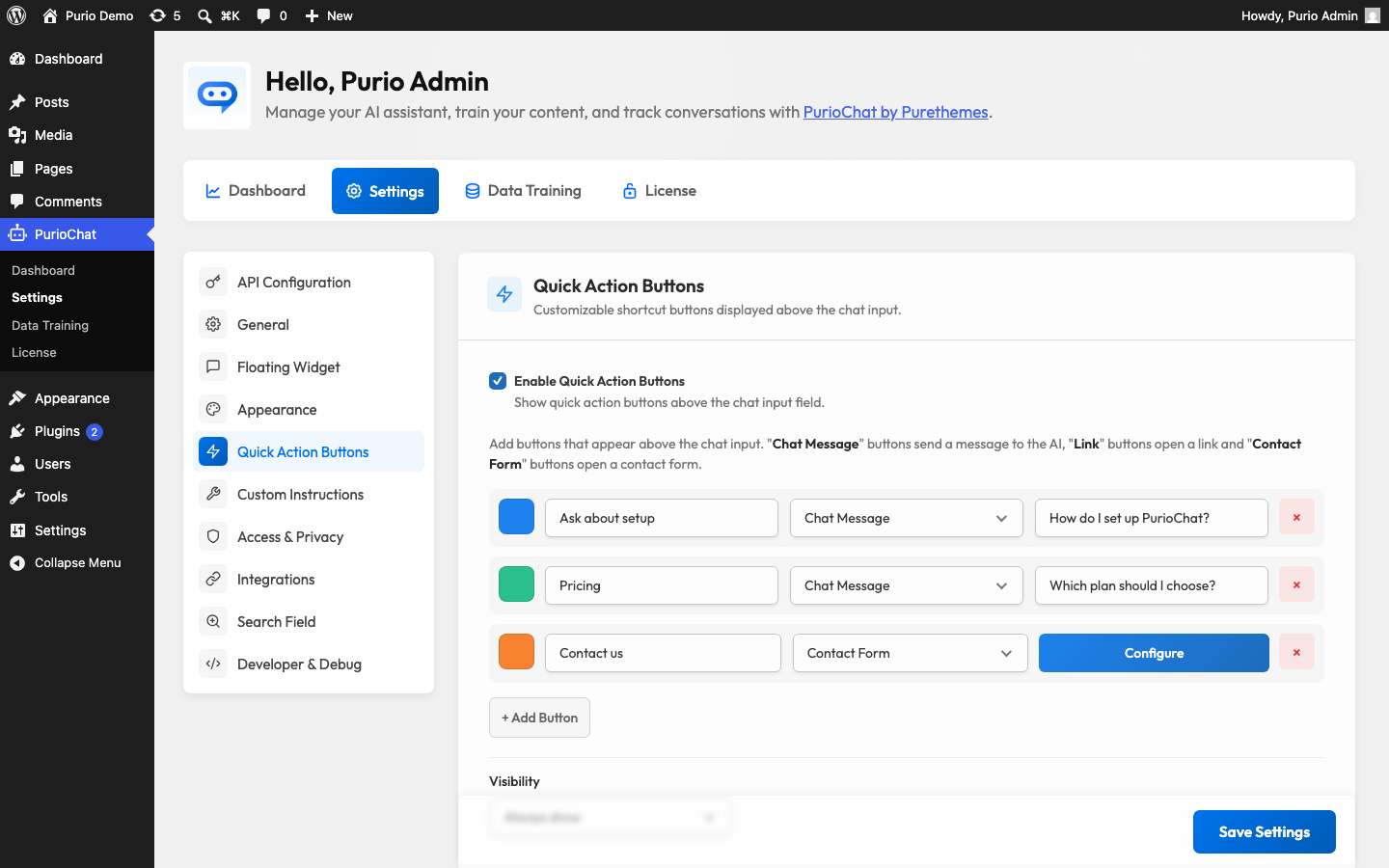
Button types (Pro)
| Type | What it does | What goes in Value |
|---|---|---|
| Chat Message | Sends a preset message to the AI as if the visitor typed it. Good for steering people toward questions your bot answers well. | The message text (for example, “What are your opening hours?”). |
| Link | Opens a URL in a new browser tab, shown with a small external-link arrow. Use it for a pricing page, booking form, or docs. | The full URL (for example, https://example.com). |
| Contact Form (Pro) | Opens a built-in contact popup with Name, Email, and Message fields, shown with an envelope icon. | No value needed — a Configure button appears instead to set up the form. |
Custom color per button (Pro)
Each button can carry its own color via the swatch picker next to it. The picker offers your chat Primary Color (#0073ee by default) as a starting point, so buttons match your theme out of the box. Pick a distinct color to make one button stand out — say, a bright “Contact us” alongside quieter suggestions. Change the global Primary Color under PurioChat → Settings → Appearance.
When buttons appear: Visibility (Pro)
The Visibility option controls how long the buttons stay on screen:
- Always show (default) — buttons stay above the input throughout the conversation.
- Hide after 1st message — buttons disappear once the visitor sends their first message, tidying up the chat.
