Listeo User Group on Facebook
You can create custom fields, group and display them in listing overview for each category. Those fields will be also available in search forms editor so you will be able to create search form filters for your custom fields.
Add custom fields
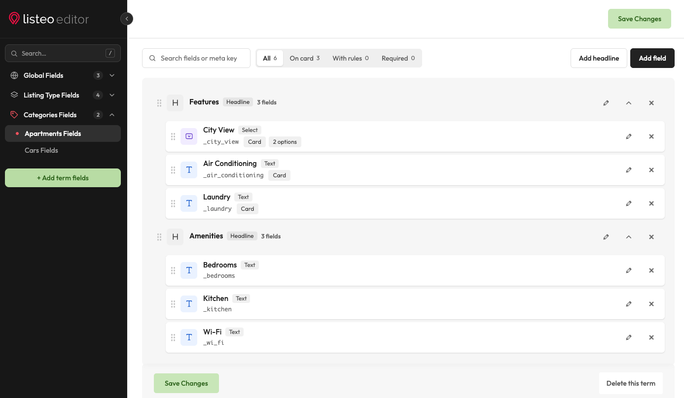
Go to Listeo Editor → Listing Fields. Fields can be added for a whole listing type, in the tabs under Listing Type Fields, or for one category only with + Add term fields (such fields appear in the Add Listing form after the owner picks that category). Click Add field, pick a type, enter a Field name (the meta key is made from it) and click Add Field. Its settings open in a side panel.
The side panel of a field has four tabs: General (name, type, icon, options), Display (Required, Show on front card, Add to search form, Width and, for text fields, Number and unit and sorting), Form input (default value, placeholder, CSS class) and Rules.
Use Add headline to start a group, then drag fields under it. Each headline becomes a titled box on the listing page, and its group can be collapsed in the list to keep long lists short.
Fields are shown automatically in the Add Listing form. For category fields, they appear after the owner selects the category.

Show a field only for some categories or answers
Since Listeo 2.3 every field has a Rules tab:
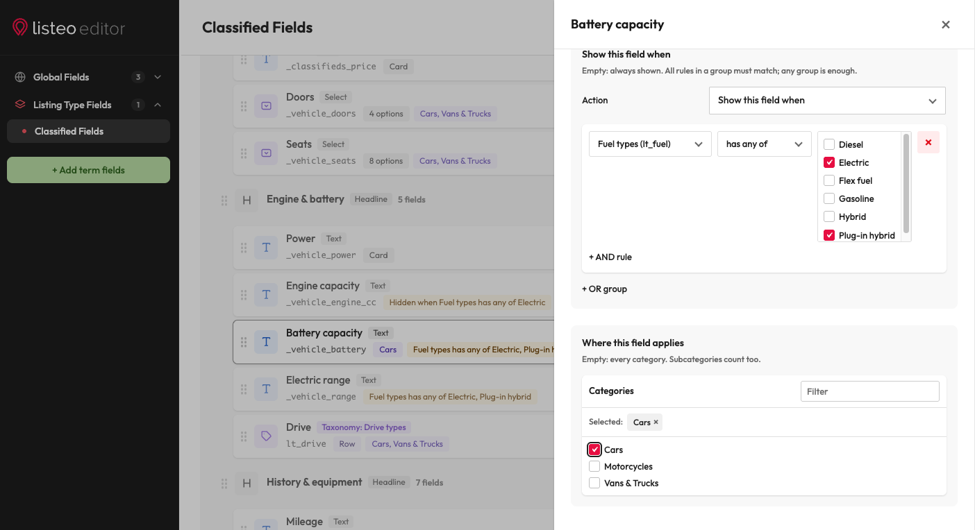
- Where this field applies: tick the categories the field is for, for example Doors only for Cars. Subcategories count too. Leave it empty to use the field for every category.
- Show this field when: show or hide the field depending on another field, for example Mileage only when Condition is Used.
The rules work in the Add Listing form (while it is filled in), on the listing page, on listing cards and in search filters. A summary is shown on the field’s card in the list, for example “Shown on Cars listings only.”
Full guide: Fields Visibility Rules.
Showing custom field on single listing page
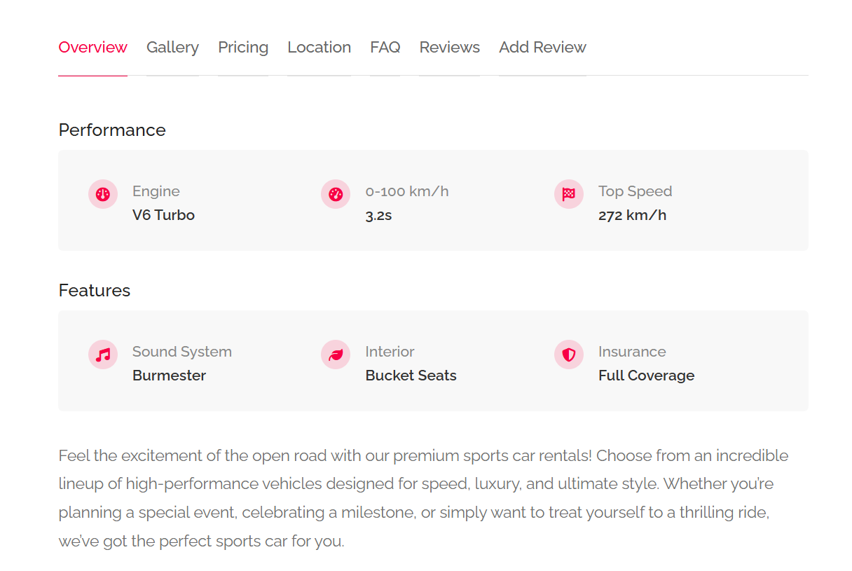
No action needed, fields will be automatically displayed
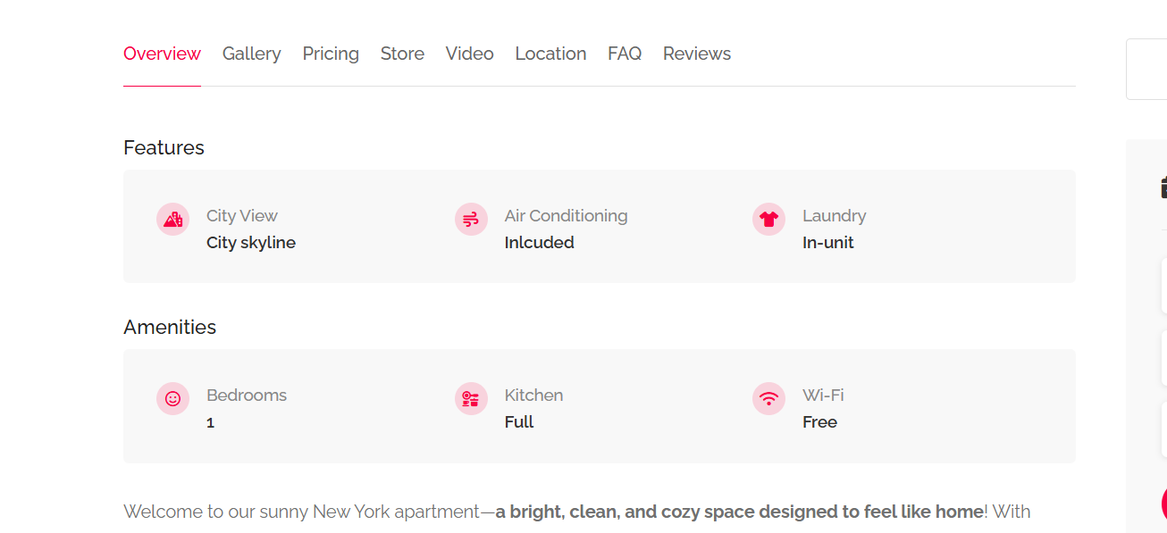
You can change how each group looks. Open a headline, go to Display → Section on the listing page and pick a Layout:
- Standard: the classic details box with round icons (shown above).
- Highlights: key facts in a row, icon, bold value and the label under it. Set the number of Columns (2 to 6).
- Table: one row per field, label on one side and value on the other.
Collapsible (Off / Open by default / Collapsed by default) lets visitors fold the group by clicking its headline.
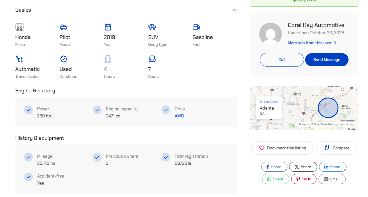
More display options on each field:
- Number and unit (Display tab of text fields): thousands separator, decimals and a unit before or after the value, for example “74,000 km”. Leave the separator off for years and codes.
- Upload SVG next to the icon picker: your own SVG icon instead of a font icon. Only users who can post unfiltered HTML (administrators) can upload SVG files.
- Taxonomies among the fields: with Place in the box “Taxonomies you can add to this list”, a taxonomy such as Make or Fuel is shown inside a group, as a row, as tags or in its own box.
Showing custom field on listing card
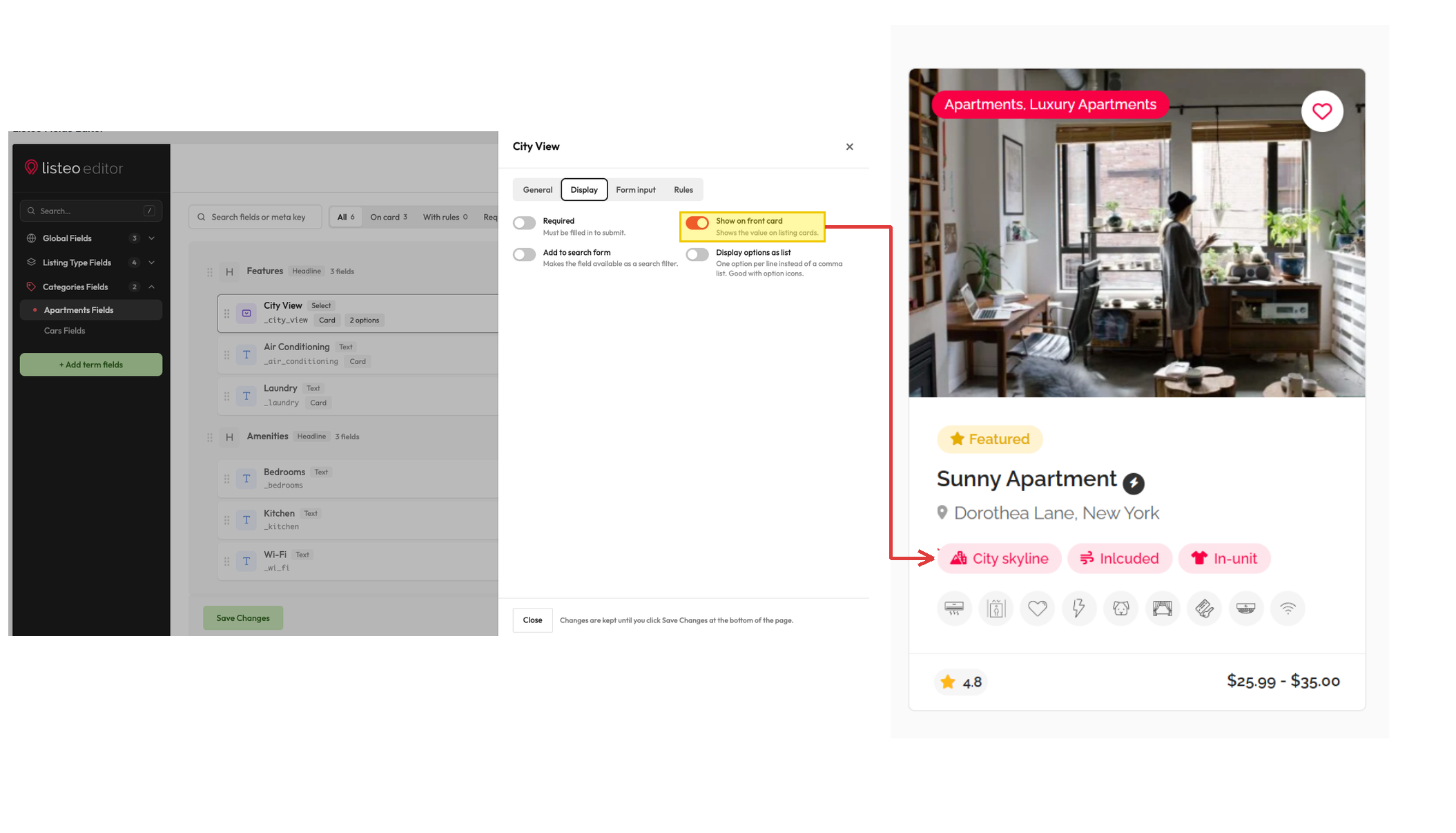
Open the field and tick Show on front card on the Display tab. The field is shown on listing cards with a tooltip on hover. Fields shown on cards have a Card chip in the list, and the On card filter at the top of the list shows them all.
To show the label as well (for example “Mileage: 74,000 km” instead of “74,000 km”), tick Show the label on cards under Number and unit (text fields only).