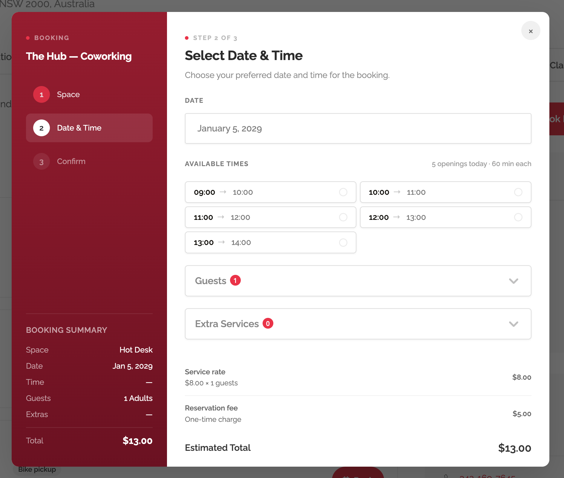
The Booking Plus options live on the Listeo > Settings > Booking tab, in two blocks near the bottom: Listeo Booking Plus Settings and Booking Popup Appearance. They live here rather than on a separate page because they extend Listeo Core’s booking behavior — keeping them together means one place to configure how bookings work site-wide.
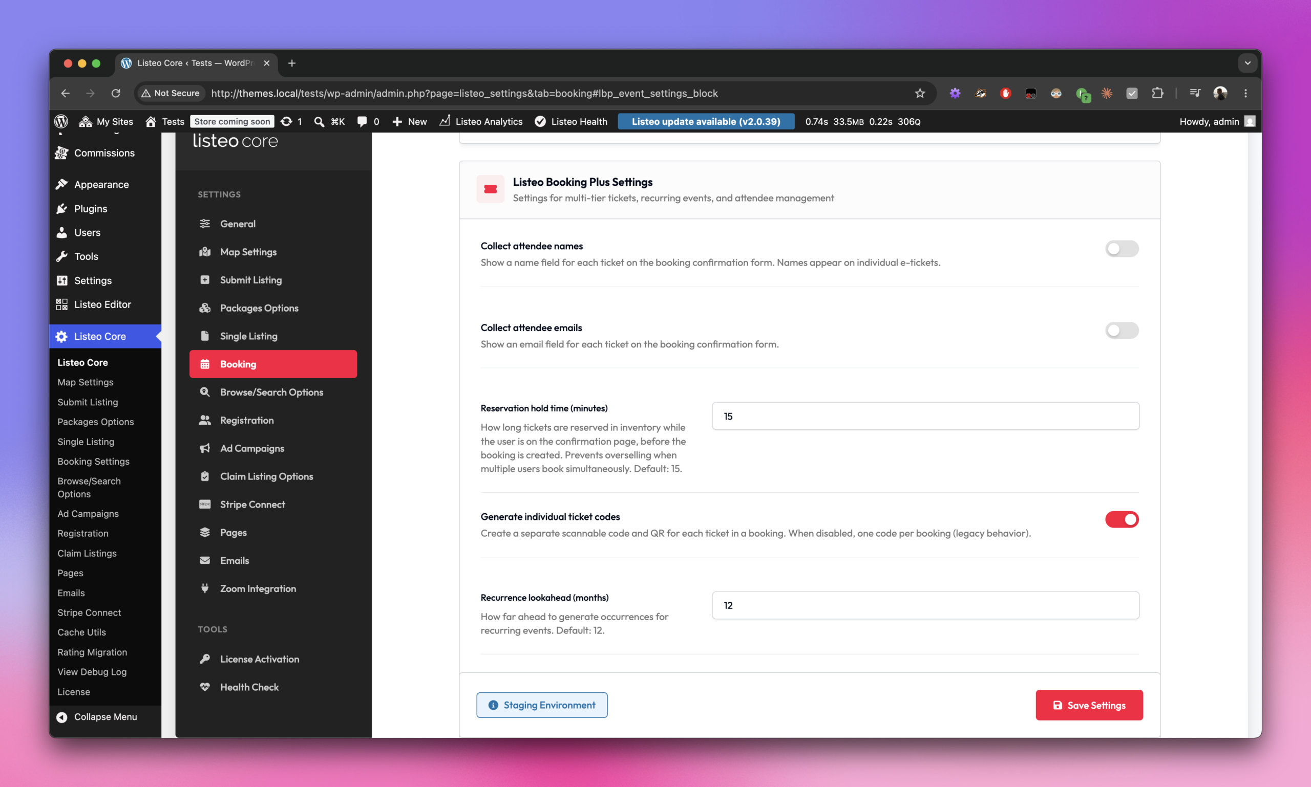
Listeo Booking Plus Settings
| Option | What it does | Default |
|---|---|---|
| Collect attendee names | Adds a name field for each ticket on the booking confirmation form. Names appear on the individual e-tickets. | Off |
| Collect attendee emails | Adds an email field for each ticket on the confirmation form. Useful when each attendee should receive their own ticket. | Off |
| Reservation hold time (minutes) | How long tickets stay reserved in inventory while a user is on the confirmation page. Prevents two customers from buying the last seat at the same time. Lower it on high-traffic events; raise it for slower checkout flows. | 15 |
| Generate individual ticket codes | One scannable code (with QR) per ticket. When disabled, one code per booking — legacy behavior, fine for small private events. | On |
| Recurrence lookahead (months) | How far in the future to generate occurrences for recurring events. The cron job extends the window as time passes. | 12 |
| Enable service durations | Shows a "Duration" field on each bookable service. When set, the booking widget reserves enough consecutive time slots to cover it (e.g. a 90-min service blocks three 30-min slots). | Off |
| Enable Individual Services | Shows an "Individual service" toggle on each service. Customers can pick at most one Individual service per booking; non-Individual services act as add-ons that stack freely. | Off |
| Resources display layout | How resources appear on a single-listing page. List = stacked full-width rows. Grid = 2-column card grid, similar to the listings archive. | List |
Booking Popup Appearance
| Option | What it does | Default |
|---|---|---|
| Popup sidebar — color | Primary background of the popup’s left sidebar. | #2d2d32 |
| Popup sidebar — gradient end (optional) | When set, the sidebar becomes a top-to-bottom gradient from the primary color to this one. Leave blank for a solid sidebar. | (empty) |
| Popup accent color | Drives the dot accent before section labels, the active step number, the primary "Next" button and selection highlights. | #3b82f6 |